Customize the Event Slider
The Event Slider is a promotion spud that presents a specified number of events as a scrolling slide show. You have a lot of control over how the Event Slider looks and behaves. This topic describes the settings that will help you configure the Event Slider to get the results you want.
Can I use the Event Slider spud for a digital signage display?
Tip This topic assumes that you already published the calendar for which you're adding and customizing an Event Slider. It also assumes that you know how to add promotion spuds and customize spud settings by opening the Edit Settings for Event Slider page.
For help publishing a calendar, see Publish calendars. For help adding an Event Slider spud and opening the edit settings page, see Add and customize the control and promotion spuds you want to use.
Topic links
- See Event Sliders in action
- What behavior do you want to control?
- What appearance aspects do you want to control?
Event Sliders in action
Horizontal Slider
- Slider width (minimum 400 pixels) is controlled by the width of the area in which the spud is embedded.
- Slider height is calculated automatically based on the content.
- This Slider has a colored background, and a drop shadow offset to the bottom and right.
- Images are positioned left.
- Slides scroll horizontally and scrolling starts automatically. To pause scrolling, place the cursor over the Event Slider.
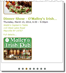
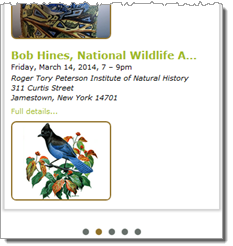
- Seven events display before the first event repeats.
- The control at the bottom of the Event Slider is the Pager. Click the buttons to manually scroll between events.
Vertical Slider
- Slider width (minimum 400 pixels) is controlled by the width of the area in which the spud is embedded.
- Slider height is calculated automatically based on the content.
- Two slides are set to show and scroll simultaneously.
- This Slider has a colored background, and a drop shadow offset to the bottom and right.
- Images are positioned left.
- Slides scroll vertically and scrolling starts automatically. To pause scrolling, place the cursor over the Event Slider.
- Seven events display before the first event repeats.
- The control at the bottom of the Event Slider is the Pager. Click the buttons to manually scroll between events.
Event Slider size
Event Slider size is calculated automatically based on the content elements the Event Slider contains and the width of the webpage container in which you embed the Event Slider.
For example, if you embed the Event Slider spud into a 500-pixel-wide container, such as a div or iframe, the slider height adjusts automatically to accommodate the images and event information the Event Slider contains.
Tip You have control over maximum image width and height and you can adjust image and event information margin and padding settings.
For example, the following Sliders are both 500 pixels wide. The top Slider's height adjusted automatically to accommodate the addition of images with a maximum height setting of 150 pixels.
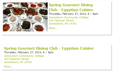
The top Slider's height adjusted automatically to accommodate images.
Which and how many events the Event Slider displays
You define the population of events the Event Slider selects from by specifying a start and end date range. You also have the option to include or exclude ongoing events that may have started before the start date and continue to take place during the specified range.
I'd like more information about ongoing events.
Two settings work together to determine the number of events the Event Slider displays: Events Per Page and Max Slides/Move Slides. These settings are described in more detail below.
Where to find the settings
- Edit Settings for Event Slider page, Settings tab, Paging section
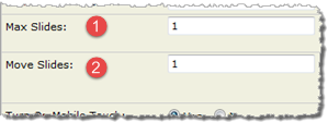
- Edit Settings for Event Slider page, Settings tab, Slider Settings section, Max Slides and Move Slides options
Which events the Event Slider displays
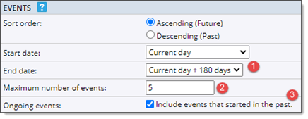
- 1 Set start and end dates to define the date range for events you want the Event Slider to display.
- 2 Keep the default setting of 5 or replace 5 with the number of events you want to cycle through the Event Slider before the first event repeats.
- Tip If the number of events per page exceeds the number of events in the date range, the date range number determines the events per page.
- How do the Events Per Page and Max Slides/Move Slides settings work together?
- 3 By default, the Event Slider displays ongoing events that start before the start date and continue during the defined date range.
- Clear the check box to show only events that actually start within the specified date range.
- Tip If you promote a large number of ongoing events, you might want to exclude them from the Event Slider. Otherwise, the ongoing events might drown out the regular events. You can always create a different version of the Event Slider specifically for ongoing events.
How many events the Event Slider displays simultaneously
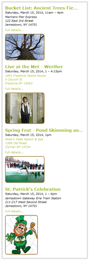
| In the Event Slider, you can display just one event slide at a time (the default) or you can display a number of slides simultaneously. The Event Slider on the right is set to show four slides simultaneously.
When you display multiple slides, you can decide how many slides to move with each transition. For example, you might refresh the Event Slider on the right by replacing all four slides with new ones. Or, you might decide to move just one slide at a time.
Tip When you display multiple slides simultaneously, the Event Slider transition mode must be either Horizontal or Vertical. Fade transitions don't work with multiple slides. |
 |
How Max and Move Slides, Events Per Page, and Pager settings work together
Events Per Page determines how many events the Event Slider displays before the first event repeats. Max Slides determines how many events display simultaneously and Move Slides determines how many of the simultaneously displayed events move with each transition. The Pager is an optional Slider control that displays a button for each transition.
The number of button in the Pager control reflects the Events Per Page and Move Slides settings. See the table that follows for a couple of examples.
| Slide settings | Pager buttons |
|
Result = 8 Pager buttons
(One slide transitions eight times before the first slide repeats)
|
|
Result = 5 Pager buttons
(Four slides transition five times before the first slide repeats)
|
How many fields events include
By default, the information displayed with each Slider event comes from three fields: Description, Date/Time, and Location/Venue. In addition, each event includes a More... link which opens the event detail view.

- 1 Description
- 2 Date and time
- 3 Location
- 4 More... link to the event detail view
In many cases, these defaults will match the event information you want to show.
However, if you want to add, remove, reorder, or re-label fields, you can make changes to the field list in the Display Settings section.
Where to find the settings
- Edit Settings for Event Slider page, Settings tab, Display Settings section
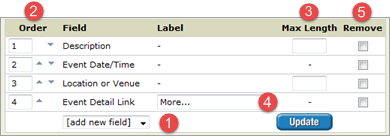
- 1 To display more fields, select them from the drop-down list.
- 2 To reorder fields, replace the numbers in the boxes and then click Update.
- 3 To truncate fields, type a max number of characters.
- Visitors can always see entire fields in event detail view.
- 4 To re-label a field, replace the existing label or type a new one.
- 5 To remove a field, select a check box, and then click Update.
The following event slider shows the results of truncating the Title field and customizing the More... link label.

Tip To create an image-only Event Slider, remove all of the default event fields. Visitors will still be able to open the event detail page by clicking the image, which is automatically hyperlinked.
Image position and size
If you use images in your events or event detail views, you can include images in the Event Slider. If you include images, you must specify a maximum image width and height and a position for the image (left, right, top, or bottom) relative to the event information.
Note You can also set a separate maximum width for when the spud is displayed at less than a specified width.
| Left/right alignment | Top/bottom alignment |
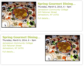 |
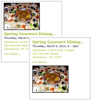 |
Where to find the settings
- Edit Settings for Event Slider page, Settings tab, Image Options section
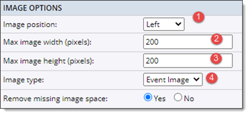
- 1 Select where you want to position the image (left, right, top, bottom) in relation to the event information.
- 2 Specify the maximum image width in pixels. Larger images are scaled to this width. Field cannot be blank.
(See the next section if you also want a separate maximum width for when the spud is displayed at less than a specified width.) - 3 Specify the maximum image height in pixels. Larger images are scaled to this height. Field cannot be blank.
- 4 Select which event field (Event image or Detail image) to take the image from.
- Tip If the images you see in the Event Slider are not the images you expect, try switching fields. Learn more about images in events.

With the settings in the Image Width Mobile section, you can specify a separate maximum width for images when the spud is displayed at less than a specifed width -- also set here.
Tips
- If you use images of different sizes, it's a good idea to set the maximum width and height with the smaller image dimensions in mind. Larger images will scale, you won't see as much white space, and events in the Event Slider will look more uniform.
- If you use images of different sizes, it's a good idea to set Even Spacing to No.
- If you remove all of the default fields from the field list (as described here), you can create an image-only Event Slider.
- You might want to coordinate the image position with the event transition mode. For example, for Sliders with left-aligned images, you might set a Horizontal transition mode while for Sliders with bottom-aligned images, you might prefer Vertical. Fade transitions work well with all image positions.
Display date icons
In Event Sliders, you can replace event start dates with customized date icons. Or, if you prefer, you can display date icons along with start dates.
I don't know what date icons are but I'd like to.
Examples of Event Sliders with customized date icons
Event Slider with date icons on the left and images on the right. Start date is hidden. Tip Date icons are always to the left of the event information. If you want to include both a date icon and an image, it's best to align the image to the right or bottom. |
Event Slider with date icons on the left and no images. Start date is hidden. |
Where to find the settings
- Edit Settings for Event Slider page, Settings tab, Date Icon Settings section
![]()
- 1 Default setting is None. To display date icons in your slider spud, select either Date Icon or Date Icon Image. For help choosing, click the blue Help button.
- 2 Select No to hide the start date in the event titles.
What to do if the event title and date icon don't line up If you add padding in the event information sections on the Event Slider's Styles tab, the date icons and the event titles may not line up. To solve the problem, edit the date icon settings. In the Date Icon Base Styles section, add pixels to the Icon margin top setting. More about customizing date icons.
Event transitions, speed, and spacing
The Event Slider is essentially a slide show of events. The transition settings give you control over how one event transitions to another. For example, you can select a vertical, horizontal, or fade transition mode. And you can specify how long each event pauses and how quickly the next event appears.
Where to find the settings
- Edit Settings for Event Slider page, Settings tab, Slider Settings section
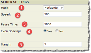
- 1 Horizontal means events move from left to right. Vertical means events move from top to bottom. Fade means events fade one into the other.
- Tip With Fade mode, it's a good idea to lengthen the default speed and pause times.
- Tip With Vertical mode, hide the Next/Previous icons, which always appear at the Event Slider's right and left edges.
- 2 Set the time it takes for one event to transition to the next. A setting of 1000 = one second.
- 3 Set the time in milliseconds the Event Slider pauses on each event.
- Tip Preview the Event Slider to make sure the pause time is long enough for visitors to take in event information and click map and event detail links.
- 4 Yes uses the maximum image width and height settings to maintain a consistent distance between images and event information.
- No aligns event information right next to images.
- Tip If you use images of different sizes, you can lessen the amount of white space in events with smaller images by setting Even Spacing to No. Use image and event information margin and padding settings to get the spacing you want.
- 5 Specify the distance in pixels between events.
- Tip This setting is particularly important if you show more than one event at a time.
Visitor experience and interactions
You have a variety of options for controlling how visitors experience the Event Slider and how much interaction they have. For example, you can choose between Pager, Next/Previous, and Play/Pause controls. You can also start the slide show automatically or leave it in visitors' hands.
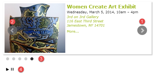
- 1 Next button (hidden by default)
- 2 Previous button (hidden by default)
- 3 Pager buttons (available by default)
- 4 Play/pause controls (hidden by default)
Where to find the settings
- Edit Settings for Event Slider page, Settings tab, Slider Settings section
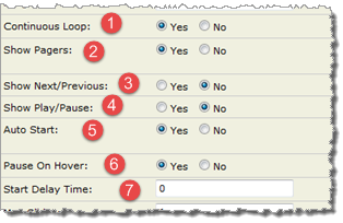
- 1 Determines how clicking Next works on the last event. Yes = transition to the first slide. No = nothing happens.
- Coordinate with Show Next/Previous (3) setting.
- 2 Yes shows and No hides Pager buttons below the Event Slider.
- Visitors click Pager buttons to manually transition between events.
- Tip By default, the Pager is centered at the bottom of the Event Slider. You can adjust the distance between the two. If you display both the Pager and Play/Pause buttons, the controls align left.
- 3 Yes adds Next and Previous buttons on top of the event content. No hides the buttons.
- Coordinate with Continuous Loop (1) setting.
- Tip Even when events transition up and down, Next/Previous icons always appear toward the right and left edges of the Event Slider. If you set Mode to Vertical, hide Next/Previous.
- 4 Yes provides visitors with buttons to play or pause the Event Slider. No hides the buttons.
- Tip Play/Pause controls seem redundant if you set Auto Start and Pause On Hover to Yes.
- 5 Yes means events start transitioning when the webpage loads. No means visitors must use controls to navigate between events.
- Tip Coordinate with Start Delay Time (7) setting.
- 6 Yes pauses the Event Slider on mouseover. No means the Event Slider ignores mouseovers.
- 7 To create a pause between when the webpage loads and events start transitioning, type a pause length in seconds.
- Tip Coordinate with Auto Start (5) setting.
Tip The Slider Settings section also includes an option for how the slider behaves on mobile devices. By default, mobile users will be able to move between slides by swiping. If, for some reason, you don't want to support swipe transitions on mobile, you can set Turn On Mobile Touch to No.
Event Slider border, corners, background, and margins
Use the general settings to optionally apply a border, rounded corners, a background color, and margins to an Event Slider.
Where to find the settings
- Edit Settings for Event Slider page, Styles tab, General Slider Settings section
- Edit Settings for Event Slider page, Styles tab, Border Rounded Corners section
Border, background color, and margins

- 1 By default, the Event Slider has a 5-pixel white border. To change the thickness, replace 5 with a number you prefer.
- To eliminate the border, set size to 0px.
- 2 To change the border color, use the Color Picker. Or, to make the border transparent, click the square to the right of the Color Picker.
- Tip A transparent border makes room for the Event Slider background color (3) to surround the images. If images vary in size, be sure to set a matching image background color.
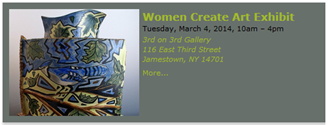
- 3 To set a background color for the Event Slider, select the color from the Color Picker. Or, to make the background transparent, click the square to the right of the Color Picker.
- Tip When you set the Event Slider background color, the image and event information background colors are automatically updated to match. However, if you set a transparent Slider background, you must manually set image and event information backgrounds to match.
- 4 To control the spacing between event slides, set the appropriate margins here.
- For example, if images are on the left and slides transition horizontally, you might want to add a right margin.
- Tip These settings matter most when you display more than one event slide simultaneously.
Rounded corners

- 1 If the Event Slider has a border (even a transparent one), you can round the Event Slider's corners.
- Tip If you set corner rounding at the base level, you'll see a grayed-out setting here. To override the base setting, click the grayed-out value and type a new value.
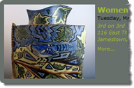
- The best way to get the rounding amount you want is to set a corner rounding value, and then preview the results. This spud has a corner rounding setting of 10px.
Pager padding and colors
The Pager is a set of buttons that appears below the Event Slider. Pager buttons indicate the number of events the Event Slider contains. By clicking the buttons, visitors can navigate manually between event slides.
You can set the Pager button colors and the padding around the Pager.
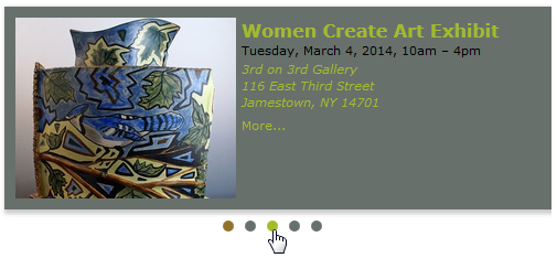
This Pager uses a different color for each of the three button states: default, active slide, and hover. Slide one is active and the visitor is navigating to slide three.
Where to find the settings
- Edit Settings for Event Slider page, Styles tab, Pager Styles section
Pager padding and color settings

- 1 Set the padding around the Pager.
- Key settings are top (the space between the Event Slider and Pager) and bottom (the space between the Pager and anything below it on the webpage where the Event Slider is embedded).
- 2 To set the default Pager button color, use the Color Picker.
- 3 To set the hover color of the buttons on mouseover, use the Color Picker.
- 4 To set the color of the buttons when the event it represents is active, use the Color Picker.
Tip Click the squares to the right of the Color Pickers to make any of the button colors transparent.
Next/Previous icon and icon arrow size and colors
Next/Previous icons always appear toward the right and left edges of the Event Slider. By clicking the Next/Previous icons, visitors can navigate manually between event slides.
You can set the Next/Previous icon size and color, and the icon arrow color.
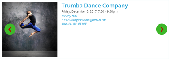
These Next/Previous icons use a larger size and different color than the default for both the icons and the icon arrows. You can see these choices in the screenshot below.
Where to find the settings
- Edit Settings for Event Slider page, Styles tab, Next/Previous Styles section
Next/Previous icon and icon arrow size and color settings

- 1 Set the size for the Next/Previous icons.
- 2 To set the link and hover colors for the Next/Previous icons, use the Color Picker controls.
- 3 To set the link and hover colors for the icon arrows, use the Color Picker controls.
Tip Click the squares to the right of the Color Pickers to make any of the button colors transparent.
Image borders, corners, colors and margins
In addition to controlling image position and size, you have several options for determining how images look. For example, you can surround images with a colored or transparent border and you can put a background color behind images that fills the space when images are missing or smaller than the maximum width and height.
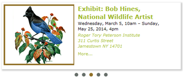
In this Slider, images have a 2-pixel colored border and extra padding on the right.
Where to find the settings
- Edit Settings for Event Slider page, Styles tab, Photo section
- Edit Settings for Event Slider page, Styles tab, Border Rounded Corners section
Photo section settings

- 1 To set a border around Slider images, replace 0 with the border thickness you want.
- 2 To set the border color, use the Color Picker.
- Tip To set a transparent border, click the square to the right of the Color Picker. When the border is transparent, the color you set for the background surrounds the image.
- 3 To set a background color for an area with the dimensions of the Max image width and Max image height settings, use the Color Picker. By default, this color matches the general background color for the Event Slider.
- Tip The image background color appears in the image space for events that have no images and fills the space for images smaller than the max image dimensions.
- 4 To control the spacing around the image, set top, right, bottom, and left margins.
- Tip The margin setting you're most likely to want to change is the margin that controls the space between the image and the event information. Which margin that is depends upon your image position setting.
Border Rounded Corners section settings

- 1 If the image has a border (even a transparent one), you can round the image corners.
- The best way to get the rounding amount you want is to set a corner rounding value, and then preview the results. Images in this spud have a corner rounding setting of 8px.
Event information format, font, color, and padding
Event information settings determine the appearance of the event fields that you display in the Event Slider. You have settings to control the event information block as a whole and settings aimed at specific fields, such as the description, date/time, and location.
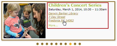
Where to find the settings
- Edit Settings for Event Slider page, Settings tab, Date/Time Options section
- Edit Settings for Event Slider page, Styles tab, Event Info section
- Edit Settings for Event Slider page, Styles tab, Description, Date. Location, Other Fields, and More Link sections
Date/Time options
| Settings | Description |
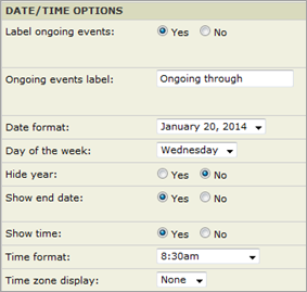
Date/Time Options, Settings tab |
Date and time settings give you a detailed level of control over which date and time elements you display as well as the format in which date, day, and time are presented.
For example, if you create a narrow, vertically-oriented Event Slider, you might want to use shorter date and day formats. If you use the Event Slider for digital signage, you might want to hide the year. You can also control whether or not to label ongoing events (if you elected to include them) and what the label should say. |
Event Info settings

- 1 To add space around the event information block, replace 0 in any of the padding fields with a number.
- For example, if you add a transparent border around the images, you may need to add padding to make the image and event information line up. Or, if you position images on the bottom, you may want additional padding at the bottom of the event information block.
- 2 By default, the event information background color matches the general background color for the Event Slider.
- To change the event information background color, click in the field, and then select a new color from the Color Picker.
Event field style settings
On the Edit Settings for Event Slider page Settings tab, you have access to settings that give you individual control over the appearance of each event field you decide to include in the Event Slider. The Location field settings shown below are representative of the settings for all the fields.
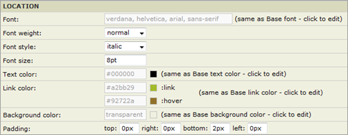
Tips
- Font and color settings are based on your base style settings.
You may not want to change any of the base defaults but, if you do, click in the grayed-out field you want to change.
- Padding settings refer to padding around the specific field. Add padding to change the distance between one field and another or indent some fields in relation to others.
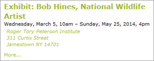
Padding settings indent the location field and add additional space above the More link.
Event slider shadow
By default, the Event Slider has a black drop shadow. If you prefer a different look, you can customize a number of settings to create the shadow color and effect you want.
Where to find the settings
- Edit Settings for Event Slider page, Settings tab, Slider Shadow section
It can be difficult to grasp exactly what the shadow settings do. The most effective way to get the shadow you want is to experiment.
Because the settings are interrelated, change one or two settings at a time, and then click Preview at the bottom of the form to instantly see the results.
The following table offers some guidance by pairing shadow examples with the settings that produced them.
Tips
- For no shadow, set Horizontal length, Vertical length, and Spread to 0px.
- If you set a top, bottom, or side shadow and it doesn't appear or looks clipped, on the Styles tab, under General Slider Settings, increase the appropriate Margin setting.
| Description | Example and settings |
| Default settings
Results in a black drop shadow offset to the right and bottom of the Event Slider. |
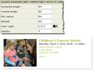
|
| Halo effect
Results in a blurred shadow effect that surrounds the entire Slider. |
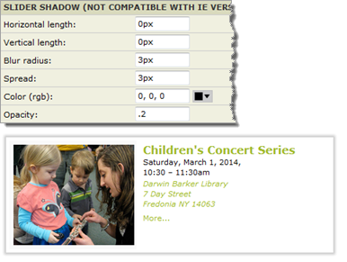
|
| Top, right offsets
Results in a slightly darker shadow offset to the top and right of the Event Slider. A negative value for Vertical length offsets the shadow at the top. |
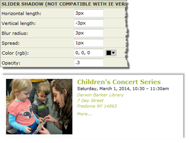
|

