Style the Tile view with featured levels
This topic describes how to use featured levels to style events in the Tile view, based on event categories, including:
- Set up a custom field and its values
- Set up a matching Featured Event field
- Verify that featured events are activated for your calendar
- Establish the color and style scheme for the featured levels and associated Date icons
- Create the Date icons for your featured levels
- Customize the featured levels
- Review your work
Important There are several methods you can use to style event tiles in the Trumba Tile calendar view. The best method for you depends on how your events are organized, and how you want to present them on your website. See: Tile calendar view.
In the example below (using the Trumba Library demo calendar), the Event Types are reflected in the display of the event tiles:
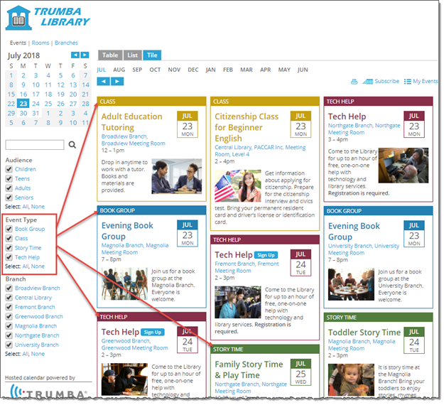
Feature levels are used to style the tile headers, event titles, and Date icons in the Tile calendar view.
To use featured levels to style events in the Tile view:
- Set up a custom field and its values.
- For the calendar that includes your stylized Tile view, go to the associated event template. See: Modify and create event templates.
- Set up the custom field (that is, a List of choices custom field) on which you want to filter your stylized Tile view. See: Create custom event fields.
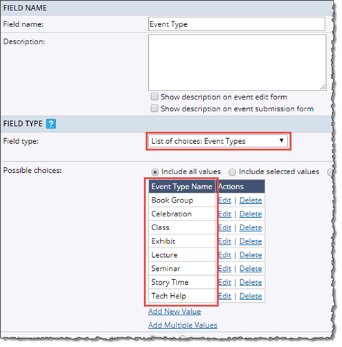
We used the Event Types custom field on the Trumba Library calendar (shown above) to categorize the events for our demo.
Notice here the values we used when setting up the custom field ("Book Group," "Tech Help," and so on). We'll use matching values when setting up the featured levels.
- Set up a matching Featured Event field.
Note If you used the Trumba Startup Wizard to create your calendar, your default event template already contains a single-level Featured Event custom field. See: Get Started 1: Review your live calendar and Trumba editing environment.
In the same template (as in step #1), set up (or modify, if it already exists) a List of choices: Featured Levels field, with the same values you applied in step #1.
Featured levels match the values you set up here:
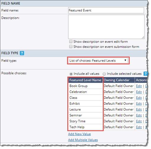
Important You'll configure the color and style scheme for the tiles representing each of these values (or featured levels in step #4 below.
- Verify that featured events are activated for your calendar.
Note If you used the Trumba Startup Wizard, featured events are already activated for your calendar. Otherwise, continue with this step.
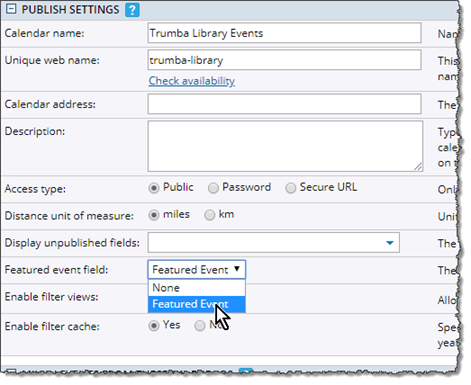
In Edit Publish Settings, for Featured event field, select the name of the featured event custom field you created, such as here:
- Establish the color and style scheme for the featured levels (see step #2) and associated Date icons (see step #5).
In the screenshot at the top of this topic, notice that we used the same styling (font, font size, image position, date icon position, etc.), except for the different colors (for the tile headers, event titles, and Date icons) for each of the four Event Types.
- For information about designing Date icons, see: Date icons in spuds.
- For information about designing featured levels, see: Customize featured event layouts.
Note your color and style scheme decisions -- you'll apply them in step #5 and step #6.
Tip To apply colors in the Trumba editing environment, you can use the Color Picker, or assign a hexadecimal value directly for each color. (Make sure to note the values you use.) See: How event colors work.
- Create the Date icons for your featured levels.
- On the Publishing Control Panel for your calendar, on the Promotion Spuds tab, click Add a Date Icon at the top.
- Select Date Icon, and then click OK
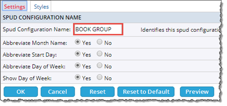
- On Edit Settings page, Settings tab, name your Date Icon to match one of your featured levels.
We used the values from our custom field we created in step #1, such as with "Book Group" here:
- On the Edit Settings page, Styles tab, apply the color and style scheme you established in step #4.
- Repeat for each value you created in step #1.
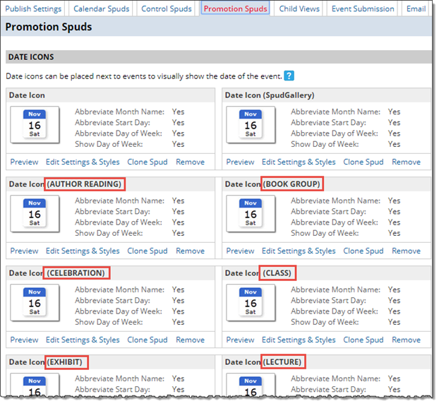
When you're finished, you should have Date Icons created for each value, similar to how we set it up for our Trumba Library demo calendar:
For information about designing Date icons, see: Date icons in spuds.
- Customize the featured levels.
- On the Publishing Control Panel for your calendar, on the Calendar Spuds tab, in the Tile section, open the Edit Settings for Tile View page.
- On the Edit Settings for Tile View page, General Settings tab, under Event Layout, notice the featured levels you set up in step #2.
Highlighted in the screenshot below, for example, are the four featured levels we showed in the screenshot at the top of this topic:
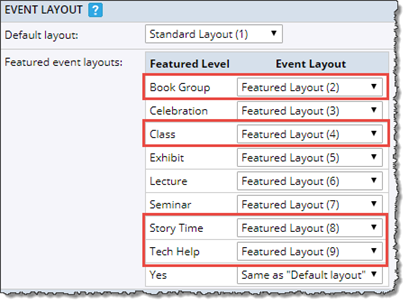
- For each featured level, under the Event Layout column, select Featured Layout, as shown above.
Note By default, events in the calendar view are formatted according to the Default layout. You're changing your featured levels to use the Featured Layout instead -- to indicate that you want to create and use new layouts for the featured levels.
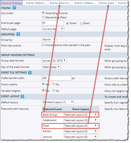
Notice that for each featured level, there is an associated tab on the Edit Settings for Tile View page.
Here for example, you can see the tabs for two of the featured levels from our Trumba Library calendar:
- Click a tab associated with a featured level, and then customize the settings, as appropriate.
Key settings include:
- Apply the color and style scheme you established in step #4.
Note While options include borders, padding, colors, font settings, and more, we used the same settings in all of the featured levels, other than for the labels, Date icons, and colors for the tile headers and event titles. (See the example in the screenshot at the top of this topic.)
- Change the Featured label for each featured level to match the value from your custom field (see step #1), such as with "Book Group" here:

- Assign the Date icon you created in step #5 to the associated feature level. For our example, on the Book Group featured level, we assigned the Book Group Date icon:
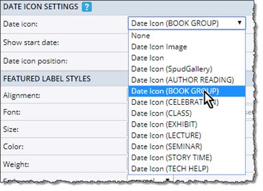
- Set the text and background colors for the featured label to match the Date icon label colors:
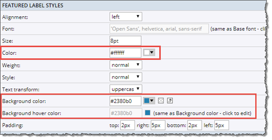
Notice in our example, that the featured level label text color (set using the Color control) and background color (set using the Background color control) matches the Date icon label text and background colors:
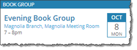
Tip Always set a high contrast between the text color and background color for the featured level and Date icon labels to ensure readability.
For information about designing featured levels, see: Customize featured event layouts.
- Apply the color and style scheme you established in step #4.
- Repeat for each featured level tab.
- After you finish customizing the tabs, save the changes by clicking OK at the bottom of the page.
- Review your work.
Make sure to preview your calendar to verify results, using the Trumba hosted view. (See: Preview your calendar with the hosted view.)
Important To view and test all the featured levels, make sure to include test events on your calendar that are tagged with the custom field (and all of the values) you set up in step #1. Having featured events in place lets you preview the layouts as you customize them.
