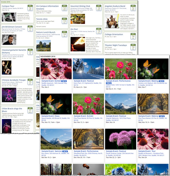
Tile calendar view
The Tile calendar view displays your events and images in tiles, arrayed in columns.
What are calendar views?
Use when your goal is to
- Present events (and images) in a grid, using either fixed- or variable-size tiles.
- Group event tiles in sets of approximately 5 to 30.
- Publish a calendar view that automatically adjusts to variable screen widths, on desktop PCs and mobile devices.
Don't use when your goal is to
- Present events in as compact a way as possible.
- Present events in a traditional calendar format.
Description
With the Tile calendar view, tiles can have fixed heights, forming a consistent grid, or variable heights, dynamically positioned within the vertical columns on the page (often called “Pinboard style”).
The Tile calendar view is designed for optimal display on phones and tablets. The tiles (and thus, the vertical columns on the page) can adjust in width to fill each row of tiles as close to the Preferred tile width setting as possible. After the threshold is met, the number of columns displayed automatically changes to fit the available space, down to one event per row.
You can also set paging and grouping options, similar to other calendar views. For more information go to Organize events on a page.
Note Images and text are cropped to fit within the tiles. We recommend that you test the various width and height configurations to determine the optimal settings for your event content. For more information, review the "Examples" and "Settings to notice" sections below.
Examples

Tile calendar views
Settings to notice
Top left calendar: Internal demo calendar, with default settings
- On the General Settings tab (first tab on the Edit Settings for Tile View page), key settings include:
- In the Event Tile Settings section:
- Preferred tile width. The default preferred width is set by default for the optimal mobile display at one tile per row. Smart-width tiles adjust in width to fill each row of tiles as close to this setting as possible before the number of columns changes to fit the available space. Fixed-width tiles stay exactly at this set width.
- Smart widths. The default is Yes, allowing the event tiles to adjust in width (based on the Preferred tile width setting), before the number of columns dynamically changes to fit the available space.
- Variable heights. The default is Yes, allowing tile heights to vary based on the size of each tile's content. With Variable heights set to No, tiles are of a uniform, fixed height. Tiles are ordered from left to right, and top to bottom.
- In the Event Tile Styles section:
- Tile height. The default setting here doesn't affect the default calendar shown at the upper left, since this setting only applies to fixed-height tiles.
- Tile spacing horizontal and vertical. The default buffer (at 8px for horizontal and vertical, for both of the examples above) around the tiles.
- Border width. The default width of the border (at 1px in both of the examples above).
- Border corners. The border corners for both examples above (at 0px in both of the examples above) inherits its setting from the base settings. For more information, go to Spud Style Settings.
- On the Styles tab (second tab on the Edit Settings for Tile View page), key settings include:
- In the Event Tile Styles section:
- Tile inner padding. The default settings provide the spacing between the content inside the tile and the tile border. As you'll see in the discussion below, we've changed one of these settings for the bottom-right calendar.
- Separator line width. By default, there is no separator line (rule) between the image and the text fields, as shown above. Setting the width to 0px disables the separator.
- Sign-up button padding. The Sign-up button always follows the event title within the tiles. These default settings create the buffer between the button and the event title text, as you can see in the bottom-right calendar.
- several other settings. Many of the other controls in this section inherit their settings from the base settings. For more information, go to Spud Style Settings.
|
Bottom right calendar: Sample events, with fixed-size tiles and images
- The list below includes all the changes applied, starting with the default settings, to achieve the view shown in the bottom-right calendar (which uses sample events supplied through the Trumba Startup Wizard):
- On the General Settings tab (first tab on the Edit Settings for Tile View page):
- In the Event Tile Settings section, set Smart widths and Variable heights to No to create fixed-width and fixed-height tiles.
- On the Styles tab (second tab on the Edit Settings for Tile View page):
- In the Display Settings section, for Field List, move Event image to the top and remove Description, as shown in the bottom-right calendar.
Tip If you have the Detail image custom field set up for your calendar template, and you've selected Detail image in the Field list, event tiles display the Detail image by default. If no Detail image is uploaded for an event, the tile displays the Event image. Don't select both Detail image and Event image in the Field list, as the events can then include both images (where both exist) for an event.
- In the Event Image Settings section:
- Set the Image position to Center.
- Set the Max image height (pixels) to 200.
- Set the Max image width (pixels) to 300.
Note The key here is that the width of the images is at least as large as the Preferred tile width setting so that the image fills the available vertical space within the tile.
- In the Date Icon Settings section, set Date icon to None.
- In the Event Tile Styles section, set Tile inner padding, top to 0px, to allow the image to fill the tile to the top of the available space.
- In the Event Image section, set Padding, right to 0px, to allow the image to fill the vertical space available within the tile.
|

