Calendar, event detail, and popup views include a variety of buttons and icons, including:
Important This topic covers how to set up either default or custom buttons and icons for individual calendar, event detail, and popup views, as appropriate. For paging button controls and event registration sign-up buttons, however, you can instead use base buttons, which apply automatically wherever they're displayed. For information about base paging buttons, go to: Paging Buttons tab; for base sign-up buttons, go to: Sign-up Buttons tab.
I'd like more information about calendar, event detail, and popup views.
How do the new and updated event icons work?
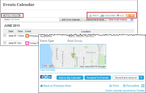
Default buttons and icons in calendar and event detail views
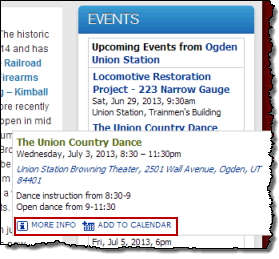
Default icons in popup view
Tip You can also replace the default event submission form Next, Back, Submit, and Submit Another Event buttons with custom buttons. Learn more.
Examples of custom images include:
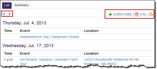
Custom buttons and icons in calendar view
Tips If you prefer text-only links for event updates, event actions, and calendar actions, you can turn off icons altogether.
Where do I find out about custom registration buttons?
You can set icons on a global level so the settings apply across all calendar, event detail, and popup views in a publication.
If you want to use the default icons, you don't have to change any icon settings. The default icons are designed to work well with any color scheme and background color. They automatically match the link text color you assign when you set your spud styles.
If you want to change the styles of some of the default icons or if you want to upload your own custom icons, follow the steps described here.
The following instructions assume that you have already published your calendar.
Wrong assumption. Before I keep going, I need help publishing my calendar.
Tip On the tab, hover over each icon setting to see a preview of the icon.
Classic icons are richer in color and depth, but work best on a white background. They don't automatically reflect link text color the way the default icons do.
Default icons (top) versus classic icons
To switch the Add to My Calendar, Forward to Friends, and Sign Up icons from default to classic, for Reset icons to, select Classic icons.

I need help using the image field controls.
Tips
Select No image to use a text-only action link.
For the paging controls, you can apply assigned images separately in each calendar view you're using, as well as in the Date Finder promotion spud. This may make sense if you have your own custom images available and/or you want to tailor the button style to the style of the view. (To instead set up global paging buttons, which apply automatically wherever they're displayed, see Paging Buttons tab.)
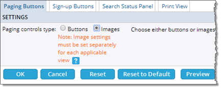
To use images for the paging controls, go to the Publishing Control Panel, Calendar Spuds tab, and then the Main Calendar Spud section. Under the Main Calendar spud, click Edit Settings & Styles, go to the Paging Buttons tab, and then click Images, as in the screenshot below.
There are no global settings available when you use assigned images for the paging controls, but there is a small set of common images from which you can select for each spud.
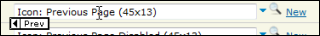
For example, you can choose among different sizes of default paging images, as shown below.
You have three default paging button choices: regular (45x13), small (12x13), and tiny (9x11).
Or, you can upload your own custom button images.
Custom paging buttons.
Settings tab, Paging Buttons section
Tip Hover over a button field to see a preview of the current image.
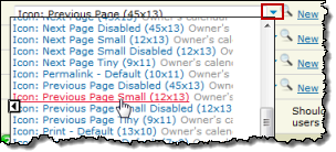
In the existing images list, select the default size you want.
Tip You might have to click a More images link to see the other default sizes.
I need help using the image field controls.
Tip Before you upload a paging button image, be sure to set the image to an appropriate size. For guidance, use the width x height pixel dimensions of the default icons that are displayed along with the icon names (for example, Icon: Previous Page (45x13) or Icon: Previous Page Small (12x13)).