Make the most of List view
List view is the most versatile calendar view.
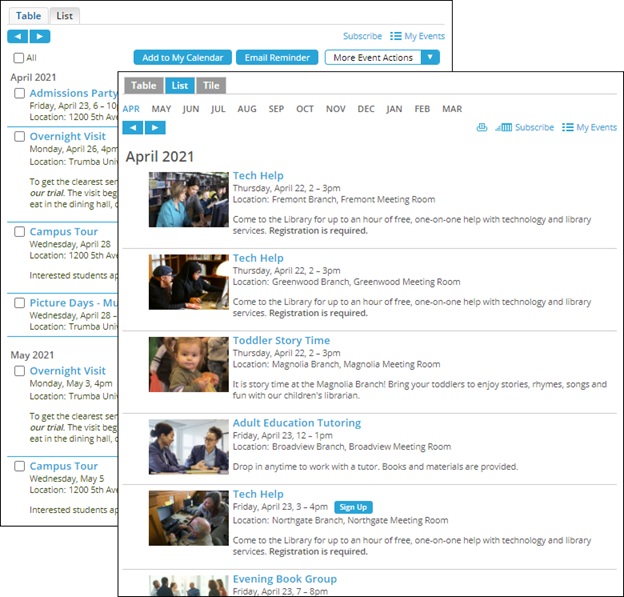
- List view supports images and featured events.
- You can control which custom fields display in your events.
- List view offers you three default layouts from which you can build your custom layout and design.
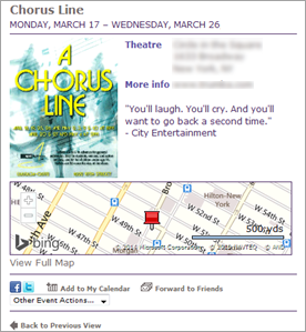
- Unique to List view is an image-only layout. If you're promoting events such as movies and performances and you've already created posters or other images that list date, time and location, you can let the images serve as the calendar events.
In this topic, you learn how to modify the List view to take full advantage of its versatility. For example, here are two List view implementations, one with images and one without:
Key List view settings
Important: The following examples assume that:
- You can get to the Calendar Spuds tab in the Publishing Control Panel, you have added a List calendar view, and you know how to open the Edit Settings for List page by clicking the Edit Settings & Styles link in the List view section. For information about getting to this point, see Customize main calendar views.
- You have set up global styles for your publication so that the List view that you create reflects your brand and color scheme. For more information, see Spud style settings.
Grouping settings
Grouping settings control how events are grouped and subgrouped in the List view. The default settings group events by month and subgroup them by week.
Advice: Don't assume you're stuck with the default settings. Choose settings that make sense for the number and frequency of events you offer. Don't ignore the Events tab. Small style changes can have a big effect on how groupings look.
Where to find the settings described in this section
- Edit Settings for List page, General Settings tab, Grouping section
- Edit Settings for List page, Events tab, General Styles section
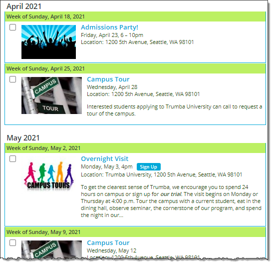
Before: The Grouping default settings
| Default settings | Applied in a calendar |

In many cases, the default settings are not ideal. For example:
|
|
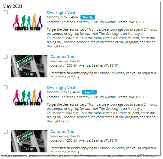
After: No subgrouping and event borders
| Small settings changes... | Make a big difference in the calendar |

On the General Settings tab, under Grouping, set Subgroup by to No subgrouping
On the Events tab, under General Settings, set a bottom border of 1 pixel. |
|
Other useful Grouping settings
- Group by Week, No subgrouping
Useful for: Organizations with a significant number of events per week but not all that many per typical day.
- Group my Month, Subgroup by Day
Useful for: Organizations that promote a large number of events per day.
- Group by Day, Subgroup by Location
Useful for: Cities, counties, and other organizations that offer many events per day in a relatively limited group of locations.
- Group by Day, Subgroup by Start Time
Useful for: Organizations with lots of events per day, especially in academic and other environments where visitors organize their days around class or other time slots.
Custom grouping
If your organization's events are governed by a seasonal or academic schedule, you can set up custom groups that reflect that schedule.
Advice Don't feel stuck with traditional time periods, such as year, quarter, month, and week. You can control the time period that constitutes a group of events.
Where to find the settings described in this section
- Edit Settings for List page, General Settings tab, Grouping section
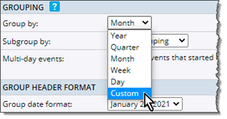
To set up custom groups, select Custom from the Group by drop-down list.
This example shows a custom group setup and the resulting calendar.
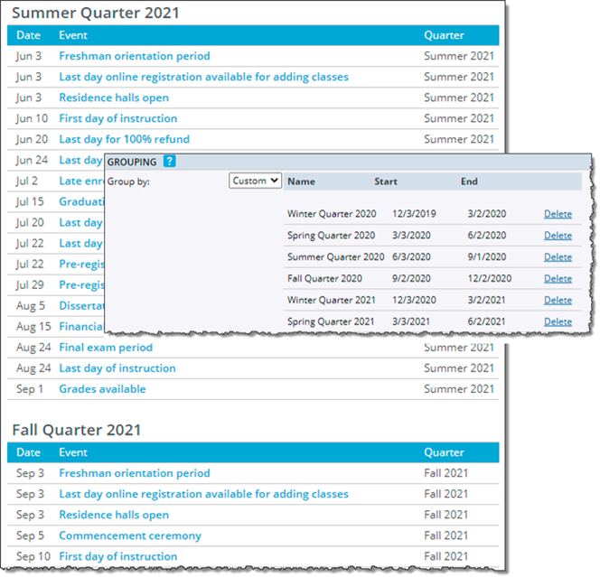
Custom groups are ideal for organizing events on academic and other seasonal calendars. For information on how to set up the above example, see Setting up academic calendars.
Images
For List view, there are two types of image settings to take into account:
- Event image settings
- Inline image settings
Tip Inline images are images you include in the Description field or in other custom multi-line text fields you create.
Event image settings
By default, List view does not display event images. However, you can use the Image Settings section to set images to display to the left or right of the event information and to define a maximum image width, and/or height.
Note You can also set a separate maximum width for when the spud is displayed at less than a specified width.
In the Image Styles section, you can control padding around images and set an image border size and color.
Advice: Don't let the default List view preview mislead you about images. List view supports images and gives you lots of options for presenting them.
Where to find the settings described in this section:
- Edit Settings for List page, Events tab, Image Settings section

For this calendar, images are set to display to the left of the event information and to have a maximum width and height of 150 pixels.
Notes:
- See the next section (in this help topic) if you also want to create a separate maximum width for when the spud is displayed at less than a specified width.
- Setting maximum image dimensions scales larger images proportionally so all images in the calendar view appear to be a consistent size.
- Edit Settings for List page, Events tab, Image Width Mobile section

With the settings in the Image Width Mobile section, you can specify a separate maximum width for images when the spud is displayed at less than a specifed width -- also set here.
- Edit Settings for List page, Events tab, Image Styles section

With image style settings, you control the space around images and whether or not images are surrounded by colored borders.
Images in a calendar, List view
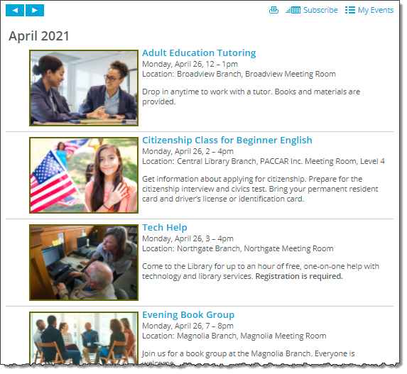
Image position is left. Max width and height is 150 pixels. Images have a 2 pixel colored border.
Tips
- Event Action display Especially if you position images on the left, you might want to change the default event action display setting. Go to the Edit Settings for List page on the General Settings tab in the Event Actions section.
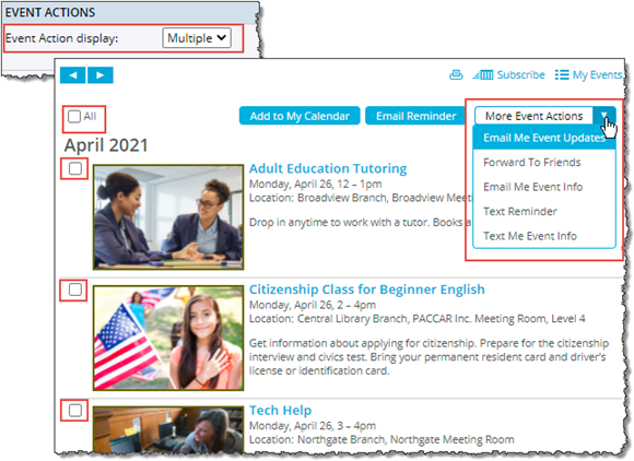
By default, event action display is set to multiple. Multiple adds a check box to the left of each event, which lets visitors take event actions on multiple events at a time but also tends to make the calendar look a little cluttered.
To hide the check boxes, set Event Action display to none. Calendar visitors can still take event actions by opening the event detail view.
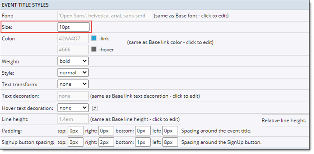
- Event Title font size
To change the font size for the event titles, go to the Edit Settings for List page, Events tab, scroll down to the Event Title Styles section, and then locate the Size setting.
General recommendation is to set the event title size at 10pt.
Inline image settings
By default, List view does not display inline images. This means that if you have images in the Notes (or other multi-text) fields and you include those fields in your calendar view, the text displays but the images do not.
If you want the images to display along with the text, you have to change the default inline image setting.
Where to find the inline images setting:
- Edit Settings for List page, Events tab, Inline Image Settings section
You might also want to display an inline image in the calendar view Description field but save all of the accompanying text for event detail view.
For example, the trainers whose calendar follows wanted the seminar events' Register Today buttons to appear in both the calendar and event detail views. And, they wanted to save space by displaying detailed seminar descriptions only in event detail view.
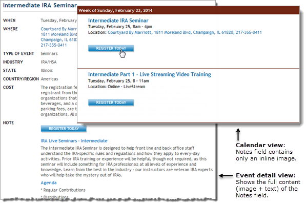
List view settings give you control over where inline images and accompanying text appear.
To display only an inline image in the Description field, coordinate the inline image and field list settings.
Where to find the settings:
- Edit Settings for List page, Events tab, Inline Images section
To show inline images in multi-line text fields, set Show inline images to Yes.

- Edit Settings for List page, Events tab, Display Settings, Field list section
To show only an inline image in a multi-line text field, make the image the first content in the field, and then set the field's max character length to zero.

Note To display only an image in a multi-line text field, the image must be the first content that you add to the field.
Date and time formats
Just as the default Grouping settings aren't ideal for many situations, the default date and time format settings are often not ideal.
Advice: Adjust the default settings until you get the right balance between the date and time formats in the group and subgroup headers and in events. Don't forget the impact that small style changes, such as color and font size, can make.
Where to find the settings
- Edit Settings for List page, General Settings tab, Group Header Format section
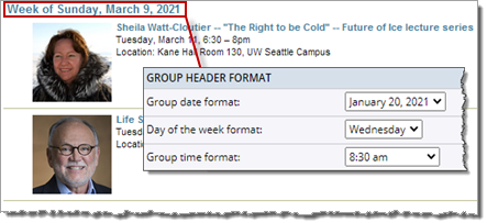
These group header settings reflect the defaults (full month and day names).
Tip Group header format settings affect both the group and subgroup headings in the calendar.
- Edit Settings for List page, Events tab, Date/Time Options section
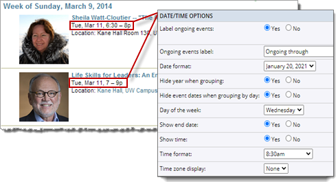
The default event date/time settings have been changed from full to abbreviated names to make it easier to distinguish header dates from event dates and times.
Small style changes have a big impact
Small style settings changes can have a significant impact on how easy it is for visitors to scan your calendar's date and time information.
Where to find the settings
- Edit Settings for List page, General Settings tab, List Groups and List Subgroups sections
- Edit Settings for List page, Events tab, Event Description Styles and Event Details Styles sections
Compare the following calendars. In the calendar on the lower right, the group header has a colored background, the event border color matches the header background, and the event title font size has been increased to make the description stand out.
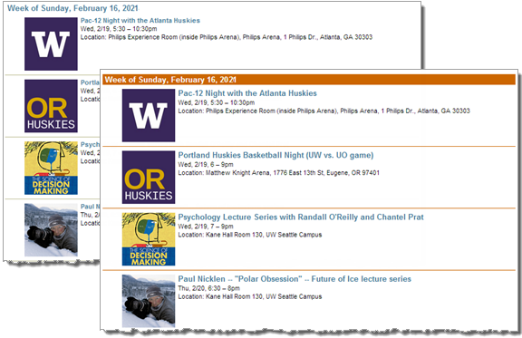
Small style changes can affect calendar readability
Field list
Field list settings give you the opportunity to decide exactly which fields you want to display in the calendar view. While displaying more fields can be informative, it also makes each event longer and more difficult to scan.
Deciding not to display a field doesn't make the information unavailable. Visitors can always see fields you choose not to display in calendar view by clicking an event title to open event detail view.
Advice: Take the time to decide not only which fields you want to display but also what order you want the fields to be in, if and how each field should be labeled, and how many characters each field can contain before it gets truncated.
Where to find the settings
- Edit Settings for List page, Events tab, Display Settings > Field list section
By default, events in List view include the title, date/time, location, and description fields. Use the field list options to add, remove, and customize fields.

- 1 Use the drop-down list to select the fields you want to include in the calendar view.
- 2 Type a name for each field you want to label. Empty boxes mean no label.
- The Title and Time Span fields don't have labels.
- 3 Set the maximum number of characters a field can contain before the text is truncated.
- The full text will always be available in event detail view.
- 4 Type numbers, and then click Update to control the order in which the fields are listed.
- 5 Select a check box, and then click Update to remove a field from calendar view.
- You can't remove the Title field.
- Edit Settings for List page, Events tab, Event Details Styles section
Use the Event Details Styles section in combination with the field list settings to control how field labels look.
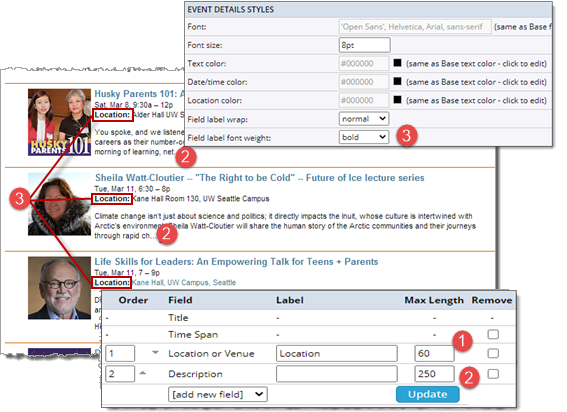
- 1 The Location field, which has the label Location, is truncated at 60 characters.
- 2 The Description field, which has no label, is truncated at 250 characters.
- 3 The Field label font weight is set for bold, which affects the Location field label in the events.
Tip Do the settings you see in the Event Details Styles section look different from the settings shown here? If so, you're using a different event layout from the Standard Layout. To learn more, see the following Event layout section.
Event layout
One of the benefits of List view is that you have three default event layouts to build your own custom layout on.

List view gives you three default event layouts.
Tip If you set up featured events, the Event Layout section looks different from this. To learn more about featured events and layouts, see Customize featured event layouts. For an introduction to featured events, see Feature events for higher visibility.
I'd like to learn more about the Image Is Event layout.
Standard and Featured layouts
The difference between the layouts is the default settings you start from. For example:
- Standard layout defaults include no images, no event background color, no event border, and multiple Event Action display.
- Featured layout defaults include images positioned to the right of the event information, an event background color, a 2px border around events, and no Event Action display.
Tip The two layouts also differ in the Event Details Styles settings (on the Events tab) that they provide.
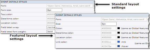
Your Featured layout color settings may look different from these depending upon how you set up your global styles.
Image Is Event layout
|
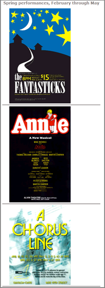
The Image Is Event layout is an image-only layout intended for a specific situation.
If you have images, such as performance or movie posters, that list the dates, times, and locations of the events, you can create a List view calendar in which the images essentially serve as the events. The List view calendar on the right started from the default Image Is Event layout. Custom settings include custom grouping of events, a border between events, no Event Action display, and hiding the Print, iCal, and RSS calendar action links. How do I hide calendar actions? Tip When images serve as events, you can still include important information, such as notes, more information links, and location maps, in the event detail view.
|
|


